

Do you ever open a report, scroll through for a few seconds, and think, “Where do I even start?”
If you run a small or midsize business, you have probably experienced this. Sales figures sit beside marketing analytics, operational metrics, and dozens of other numbers you never asked for. Every line is labelled “important,” yet somewhere between downloading the report and trying to act on it, your focus disappears.
You are not alone. Research suggests the average person processes around 74 gigabytes of information every day, roughly the equivalent of watching sixteen movies back-to-back. With that much information competing for attention, it becomes harder to see what actually matters.
So how do you cut through the noise without ignoring the numbers altogether?
For many small businesses, the answer is surprisingly straightforward. Visualise the data.
The Challenge of Data Overload
Data overload occurs when there is more information than you can meaningfully process in the time available.
In a small business environment, this information arrives from everywhere. Point-of-sale systems generate transaction data. Customer relationship management tools track interactions. Website analytics monitor visitor behaviour. Social media platforms report engagement. Accounting systems record financial performance. Industry reports add another layer of context.
When all of this arrives together, a few familiar problems appear:
• Decisions are delayed because it takes too long to separate the useful insight from the background noise
• Patterns that could highlight a risk or opportunity remain hidden in spreadsheets
• Teams duplicate work by creating their own reports from disconnected systems
Budget and expertise also play a role. Without a dedicated analytics team or expensive business intelligence platforms, many small businesses rely on basic tools or avoid deeper analysis entirely. Even when the tools exist, someone still needs to understand how to use them effectively.
If you cannot clearly see what is happening in your business, making confident decisions becomes much harder.
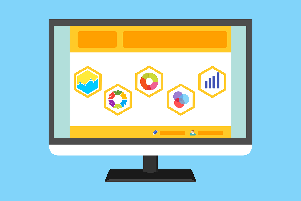
Using Data Visualization to Cut Through the Noise
Data visualization does not automatically fix messy data or poor tracking practices. However, it transforms information into a format the human brain processes far more quickly.
People recognise patterns, colours, and shapes much faster than they interpret rows of numbers.
Think about a simple line chart showing sales increasing month after month. In seconds you understand the trend. Now imagine reaching the same conclusion by scanning hundreds of rows in a spreadsheet.
Visualization compresses complexity into something you can understand at a glance.
Why Visualization Works for Small Businesses
For businesses in New Zealand, speed often matters more than perfection. Leaders rarely have the time to spend days analysing every report before making a decision.
Visualization helps because:
• Patterns appear instantly, revealing seasonal changes, sudden drops, or unusual spikes
• Decision-making becomes faster because attention stays on the most important indicators
• Teams share a common understanding because charts communicate clearly across roles
• Information is easier to remember because visuals stick in people’s minds longer than text
Visualization is not just for executives reviewing quarterly performance. A store manager monitoring inventory turnover or a marketing coordinator tracking campaign engagement benefits just as much.
Best Practices for Simple, Impactful Visuals
You have probably seen charts that looked impressive but were impossible to understand. A good visual should feel effortless to read.
These principles help keep charts clear and useful.
Start with Your Audience
Different audiences need different levels of detail. A business owner scanning a quarterly report may only need high-level trends. A marketing assistant reviewing campaign results might need more granular metrics.
Design the visual around the person using it.
Match the Chart to the Story
Choose chart types that suit the data.
Bar charts compare categories effectively. Line charts show change over time. Pie charts can work for simple proportions when there are only a few segments. Heatmaps are excellent for identifying patterns such as peak activity times.
The goal is clarity, not creativity.
Remove Unnecessary Clutter
Anything that slows down understanding should disappear. Excess gridlines, decorative backgrounds, and unnecessary labels make charts harder to read.
Keep the focus on the data itself.
Use Colour to Highlight
Colour works best when used sparingly. One strong colour highlighting a key value can guide attention more effectively than a chart filled with multiple shades.
Treat colour like a highlighter.
Allow Exploration Where Possible
Interactive dashboards can make reports far more useful. Filters allow users to zoom in on a specific week, product, or location without needing someone else to generate a new report.
This flexibility encourages people to engage with the data instead of ignoring it.
Affordable Tools and Tactics for Small Businesses
A common misconception is that useful data visualization requires expensive enterprise software.
In reality, many accessible tools already provide powerful capabilities.
Popular options include:
• Google Data Studio for free, web-based dashboards connected to common data sources
• Zoho Analytics, which offers business intelligence tools designed for smaller organisations
• Tableau Public for creating compelling visual stories from datasets
• Microsoft Excel features such as Power Query and Power Pivot for automating data preparation
• Infogram for quick infographic-style reports and simple charts
Combining these tools with basic automation can save significant time. Scheduled data imports reduce manual work. A simple data-cleaning process removes duplicates and formatting issues before visualisation.
Small improvements like these make reports more reliable and easier to act on.
Turn Your Data into Action
Data overload is not going away. In fact, most businesses will collect even more information next year than they do today.
The difference lies in how that information is presented.
Effective visualization turns a confusing mass of numbers into something you can scan, understand, and use. Instead of struggling through pages of figures, you immediately notice the trends that matter.
If your data currently feels overwhelming, begin with one simple step. Choose a single metric that matters to your business, such as monthly recurring revenue or weekly customer traffic. Visualise it clearly and review it regularly.
From there, expand gradually.
Over time, your team begins to think less about raw numbers and more about patterns, trends, and action.
If spreadsheets feel more like obstacles than tools, our team can help you simplify the picture. At Prodigi we help businesses in New Zealand organise their data, visualise what matters, and turn information into decisions that move the business forward.
Article used with permission from The Technology Press.